CompRadar Brand
Find. Trade. Win. CompRadar helps traders find the best opportunities across crypto exchanges. Our identity is built on clarity, trust, and a trader-first point of view - no hype, just signal.
Win.

Logo
The radar mark is the core of our identity. Use the wordmark lockup whenever space allows; the standalone mark only when context already establishes the brand.
16px24px48pxCompRadarDon't
Color palette
One signature color, neutral surfaces, and clear status accents. Click any swatch to copy HEX, HSL, or the Tailwind token.
Brand
On-orange pairings
Neutrals
Status
Typography
Inter is the only typeface in product UI - regular for prose, tabular figures for numbers. Space Grotesk is reserved for marketing. Never more than two faces in a single composition.
Iconography & tokens
Lucide icons at stroke-width 1.75. Hairline 0.5px borders. Border radius 0.75rem. Subtle shadows over heavy chrome.
- Radius
- 0.75rem
- Border
- 0.5px
- Icon stroke
- 1.75
- Body weight
- 475
Banners & social
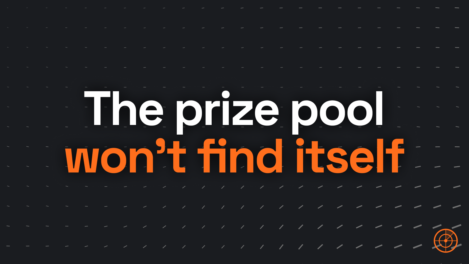
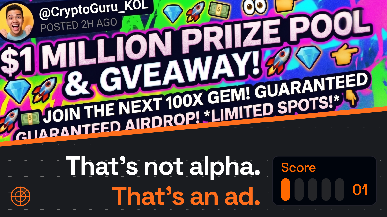
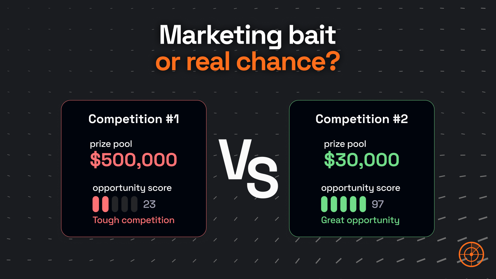
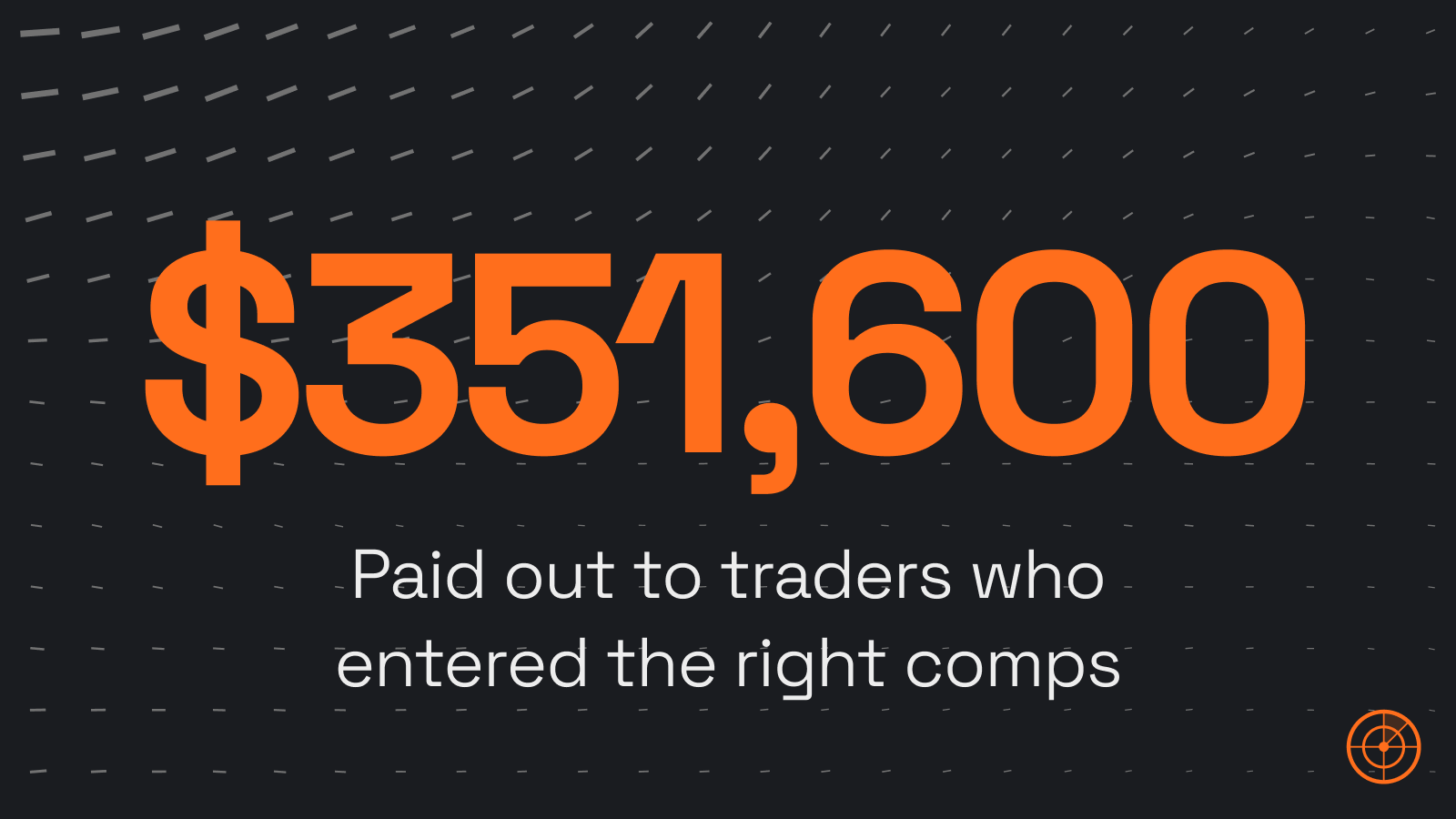
Marketing surfaces use Space Grotesk on the dark background, with the radar mark anchored bottom-right. One sharp line, one accent, one idea per banner.
in orange
Do
- One headline, one accent color, one mark.
- Lead with a number, a contrast, or a sharp claim.
- Let the dash texture breathe behind the type.
Don't
- No emojis, no rainbow gradients, no stock-photo collages.
- No more than two type sizes per banner.
- No drop shadows on the logo or recoloring of the mark.
Voice & tone
We sound like a sharp trader friend, not a marketing department.
Do
- Lead with specifics: prizes, fees, deadlines.
- Be plain. Short sentences. Active voice.
- Respect the trader's time and intelligence.
Don't
- No hype words: "insane", "massive", "unbeatable".
- No emoji-laden marketing copy.
- No vague claims without numbers.
Downloads
Grab individual files or pull the whole brand kit as a zip.
